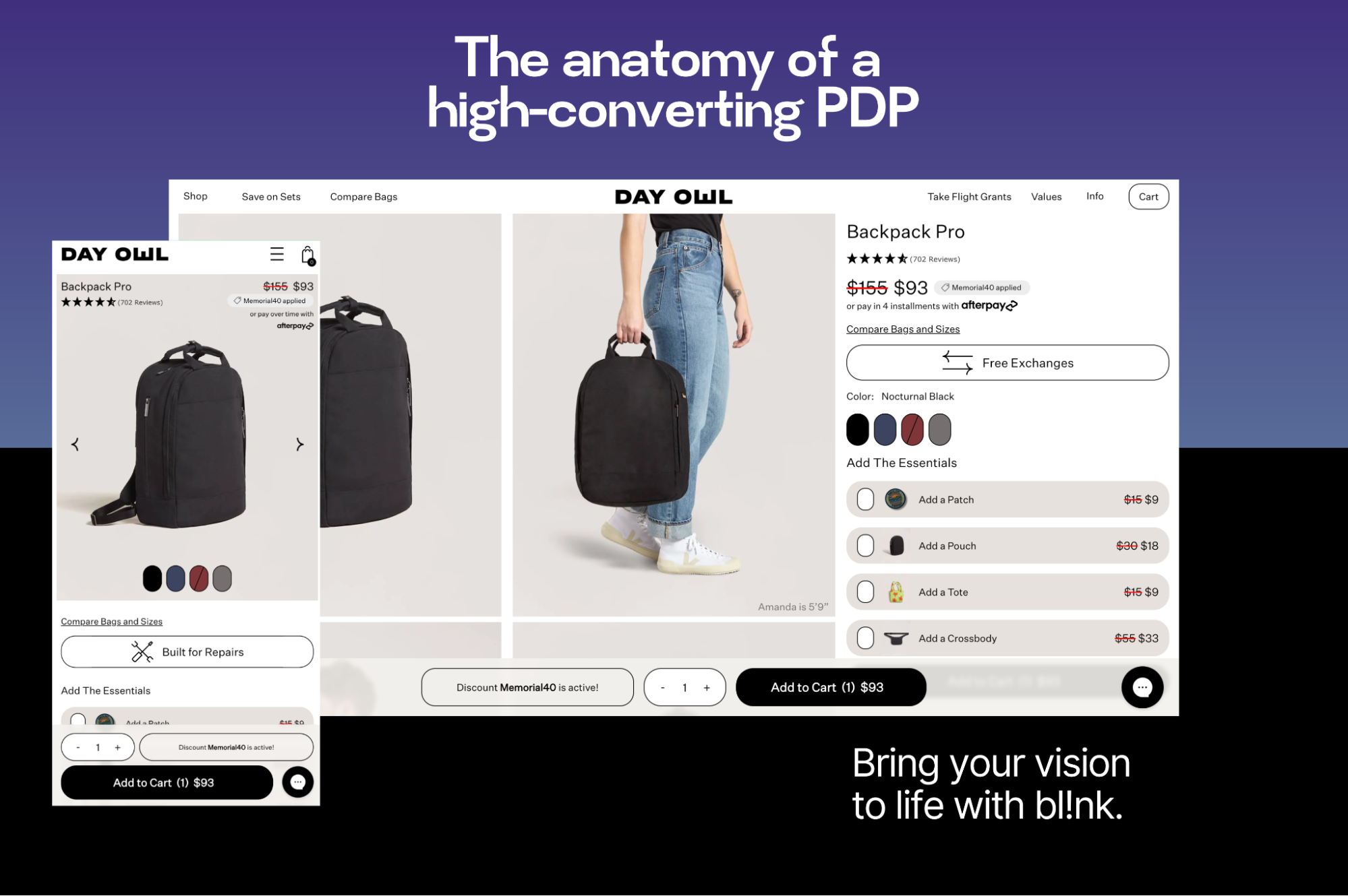
Your product detail page (PDP) is where the moment of truth happens.
You’ve spent time and money driving traffic through paid ads, organic search, and email campaigns—now what? If your PDP doesn’t immediately communicate value, build trust, and make conversions easy, all that effort hits a wall. Users bounce. Carts get abandoned. And revenue slips through the cracks.
A strong PDP isn’t about pretty visuals. It should be a performance-driven blend of structure, speed, and storytelling. It’s where technical UX meets brand identity and where tiny details can make or break your bottom line.
Let’s walk through the core components of a high-converting, user-first product page, from layout and imagery to messaging and cross-selling.
Your PDP is the digital equivalent of a showroom display. It needs to instantly communicate value, ease friction, and guide users toward a confident purchase, especially on mobile. The layout and structure you choose set the tone for how users interact with the rest of your site.
With mobile traffic now outpacing desktop on nearly every ecommerce site, mobile-first design is the baseline. PDPs should be designed specifically for small screens first, rather than shrinking a desktop experience down to fit.
Mobile-first PDPs should:
Mobile users are often browsing on the go or while multitasking. Every element of your layout should be intentional, streamlined, and conversion-focused.
When a user lands on your PDP, the first screen they see without scrolling is prime real estate. The above-the-fold area should immediately answer what the product is, how much it costs, and how to buy it.
At minimum, your above-the-fold content should include:
If users have to scroll just to figure out what they’re looking at, you’ve already introduced friction.
Not every user needs every detail right away, but some users do want the deep dive. A well-structured PDP balances:
Use a clear typographic hierarchy (H1, H2, H3, etc.), spacing, and intuitive design patterns like accordion tabs to help users scan and find what matters most to them.
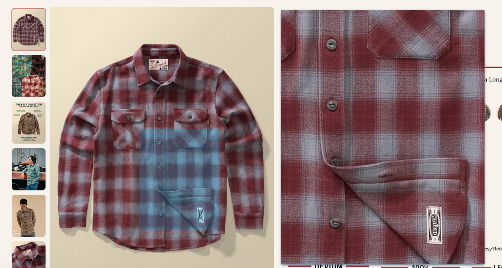
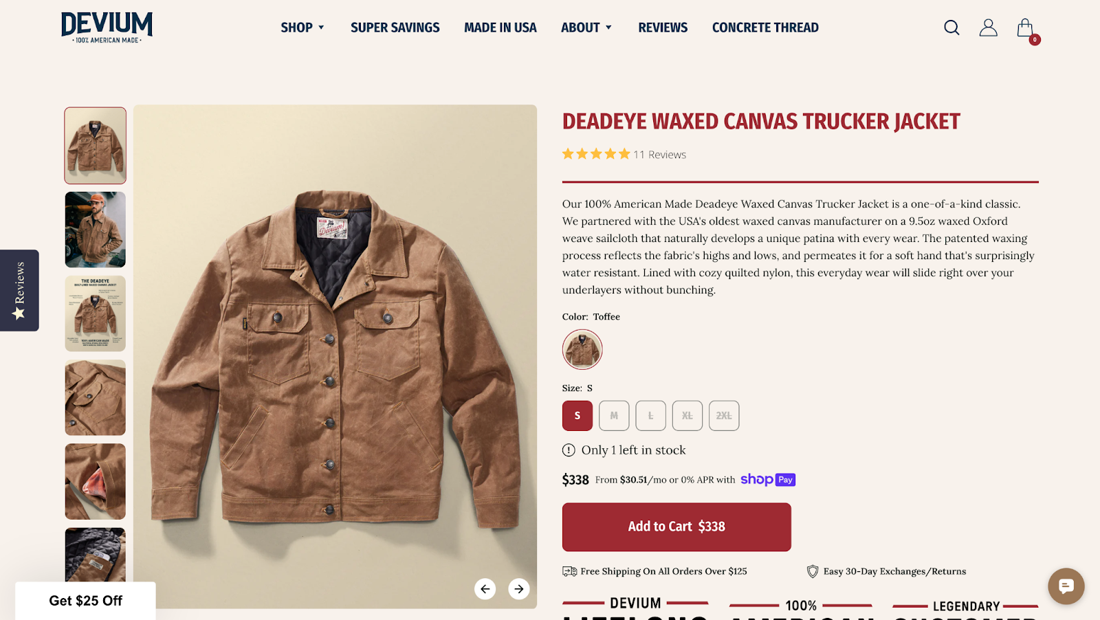
Shoppers can’t touch, feel, or try on what you’re selling, so your imagery needs to bridge that gap. Great PDP visuals reduce hesitation, answer unspoken questions, and build trust faster.
Your product images should be sharp, detailed, and consistent. Invest in high-res photography that allows users to zoom in and examine textures, stitching, buttons, or finishes. Blurry or poorly lit photos look amateur and make your product feel low-quality.
Show the product from multiple angles and keep backgrounds clean and neutral to spotlight the item.
Lifestyle photography puts your product in context and helps users imagine themselves using or wearing it. These images can tell a story, convey scale, and create emotional resonance.
Sometimes, a still image isn’t enough. For products with motion, unique features, or multiple use cases, a short video can make all the difference. Even a 5-10 second clip showing the product being used can drastically improve conversion.
Alt text serves two major purposes: accessibility and SEO. For screen reader users, descriptive alt text ensures the page is inclusive and informative. For search engines, it provides valuable context for what’s shown, helping your PDP rank in image search results.
Add alt text for all images on your site, describing the image content clearly while including keywords naturally where appropriate.
Once a customer is visually hooked by your product imagery, your messaging needs to seal the deal. The copy and content on your PDP should clearly communicate what the product is, why it matters, and how to confidently purchase it.
Your product title is one of the first elements both users and search engines see. It should be clear, descriptive, and keyword-optimized without sounding robotic. Think of it as the “headline” of your product’s story.
A good title includes:
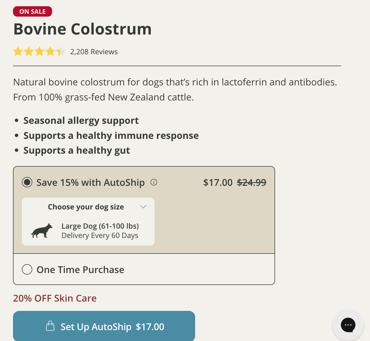
Never make users hunt for pricing. It should be clearly displayed and easy to understand. Use visual cues like strikethroughs, color changes, or messaging like “Save X%” to show markdowns.
Price sections should include:
Shipping and return policies are often the tipping point between cart abandonment and conversion. Be upfront about estimated delivery windows, free shipping thresholds, and return timelines and conditions.
Make this information accessible via expandable sections or near the CTA.
You don’t need a wall of logos, but a few well-placed trust signals can boost buyer confidence, especially for new or unknown brands. You might include secure checkout icons, satisfaction guaranteed messaging, or other trust symbols.
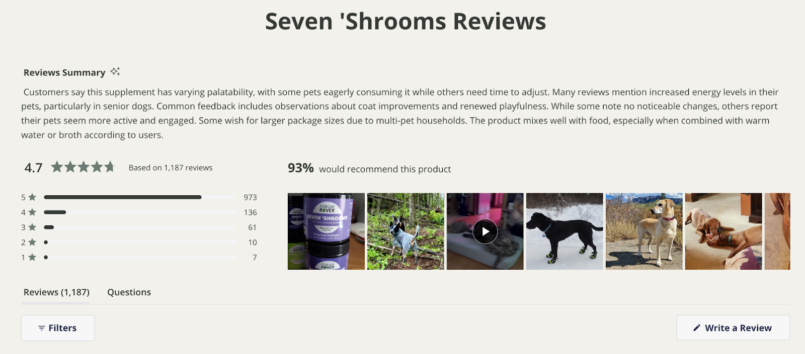
Reviews are one of the most influential pieces of PDP content. They offer credibility, authenticity, and reassurance. Make it easy for customers to see star ratings and user-submitted photos or videos.
Especially on mobile, a sticky CTA ensures your primary conversion point is always within reach. Whether users are reading reviews or scanning materials, they should never have to scroll all the way back up just to add to cart.
Some shoppers aren’t ready to buy immediately. Give them a way to bookmark products to revisit later. If you have an account system, allow saved items to sync across devices. If not, consider a simple "heart" icon or browser-based save feature.
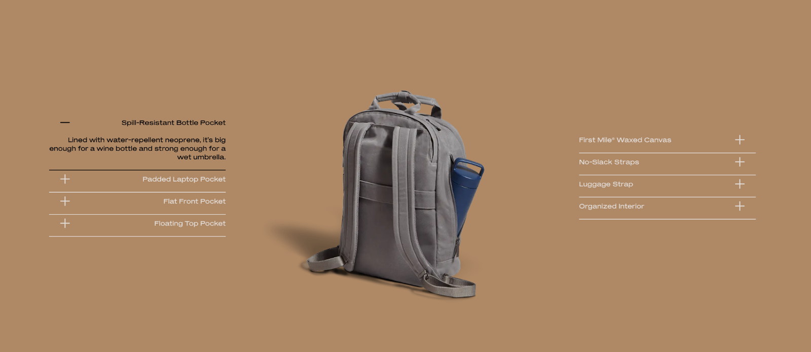
Features tell, but benefits sell. Instead of just listing what your product includes, frame your copy around how it improves the customer’s life. Use icons or short bullet lists to call out the most compelling benefits above the fold.
For more detail-oriented shoppers, technical specs matter. They want to know:
Keep this content structured and scannable. Use accordions, tables, or tabs to avoid overwhelming casual browsers while still serving informed buyers.
A great PDP creates opportunities for the shopper to continue exploring. Cross-selling and product discovery tools turn a single-page visit into a journey, boosting both revenue and user satisfaction.
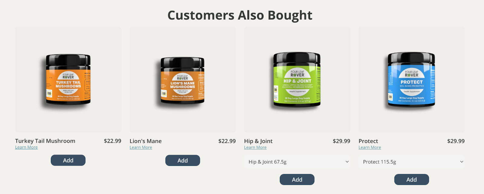
This is your first line of defense against bounce. If the shopper isn’t quite sold on the current item, related products give them curated alternatives without forcing them to backtrack to a category page.
Make sure your related product carousels are mobile-friendly, don’t slow down load time, and feature thumbnail images, pricing, and quick-view or “Add to Cart” options.
For returning users or even same-session visitors who’ve clicked around, “Recently Viewed” keeps context front and center, allowing shoppers to pick up where they left off without retracing their steps.
This feature is simple to implement and can dramatically improve your UX and conversion, particularly when users are browsing between multiple PDPs.
Cross-selling and discovery tools are experience enhancers. When done right, they make the PDP feel more like a personal shopping assistant and less like a static sales page.
Your product detail pages are the core of the customer experience. When built well, it reduces hesitation, answers unspoken questions, and drives confident conversions. When neglected, it becomes the #1 leak in your funnel.
At blink, we help brands turn their PDPs into conversion engines—whether you’re replatforming, evolving toward composable commerce, or just need a UX upgrade that actually moves the needle. Want to see what’s possible when your PDP works harder? Reach out to the blink team today to see how we can help transform your product detail pages into high-converting experiences.
Lorem ipsum dolor sit amet, consectetur adipiscing elit. Donec ullamcorper mattis lorem non. Ultrices praesent amet ipsum justo massa. Eu dolor aliquet risus gravida nunc at feugiat consequat purus. Non massa enim vitae duis mattis. Vel in ultricies vel fringilla.
Mi tincidunt elit, id quisque ligula ac diam, amet. Vel etiam suspendisse morbi eleifend faucibus eget vestibulum felis. Dictum quis montes, sit sit. Tellus aliquam enim urna, etiam. Mauris posuere vulputate arcu amet, vitae nisi, tellus tincidunt. At feugiat sapien varius id.
Eget quis mi enim, leo lacinia pharetra, semper. Eget in volutpat mollis at volutpat lectus velit, sed auctor. Porttitor fames arcu quis fusce augue enim. Quis at habitant diam at. Suscipit tristique risus, at donec. In turpis vel et quam imperdiet. Ipsum molestie aliquet sodales id est ac volutpat.

“In a world older and more complete than ours they move finished and complete, gifted with extensions of the senses we have lost or never attained, living by voices we shall never hear.”
“In a world older and more complete than ours they move finished and complete, gifted with extensions of the senses we have lost or never attained, living by voices we shall never hear.”
— Olivia Rhye, Product Designer
Dolor enim eu tortor urna sed duis nulla. Aliquam vestibulum, nulla odio nisl vitae. In aliquet pellentesque aenean hac vestibulum turpis mi bibendum diam. Tempor integer aliquam in vitae malesuada fringilla.
Elit nisi in eleifend sed nisi. Pulvinar at orci, proin imperdiet commodo consectetur convallis risus. Sed condimentum enim dignissim adipiscing faucibus consequat, urna. Viverra purus et erat auctor aliquam. Risus, volutpat vulputate posuere purus sit congue convallis aliquet. Arcu id augue ut feugiat donec porttitor neque. Mauris, neque ultricies eu vestibulum, bibendum quam lorem id. Dolor lacus, eget nunc lectus in tellus, pharetra, porttitor.
Ipsum sit mattis nulla quam nulla. Gravida id gravida ac enim mauris id. Non pellentesque congue eget consectetur turpis. Sapien, dictum molestie sem tempor. Diam elit, orci, tincidunt aenean tempus. Quis velit eget ut tortor tellus. Sed vel, congue felis elit erat nam nibh orci.